BikeShareProject
Bike Share Project
Benjamin Ramirez updated 3/28/2023
Project Description
The project involves a junior data analyst working in the marketing analyst team at Cyclistic, a bike-share company in Chicago. The team aims to understand how casual riders and annual members use Cyclistic bikes differently to design a new marketing strategy to convert casual riders into annual members. The recommendations must be backed up with compelling data insights and professional data visualizations.
About the Company
Cyclistic launched a successful bike-share offering in 2016. The program has grown to a fleet of 5,824 bicycles that are geotracked and locked into a network of 692 stations across Chicago. Cyclistic’s finance analysts have concluded that annual members are much more profitable than casual riders. Moreno believes that maximizing the number of annual members will be key to future growth. Moreno has set a clear goal: Design marketing strategies aimed at converting casual riders into annual members.
Programs and Languages Utilized
- Excel
- SQL link to scripts and analysis
- Tableau link to Tableau
- Google Slides link to presentation
Walk-through Summary:
(Cyclistic is a fictional company and the data has been made available by Motivate International Inc. under this license.)
EXCEL
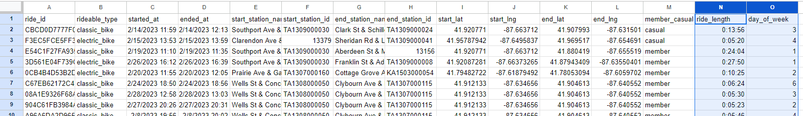
I secured the original data by storing it in my password-protected Google Drive. I then made copies of all the files and added a suffix of ‘…v1’ to each one. I opened each file in Microsoft Excel to review the data and determine what type of information was available. During this process, I added several columns to the data:
a. "ride_length" which is calculated by subtracting the "started_at" column from the "ended_at" column (=D2-C2).
b. "day_of_week" which is calculated by using the "WEEKDAY" command (=WEEKDAY(C2,1))
These formulas were copied down to include all rows of data for each spreadsheet.
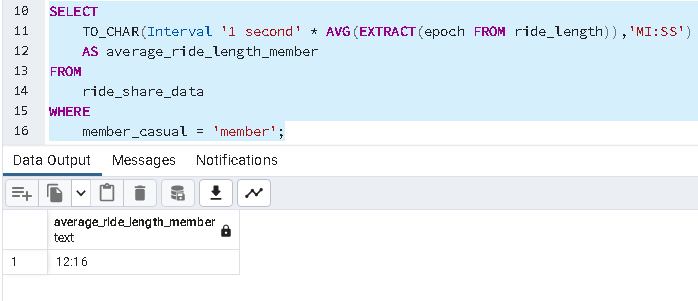
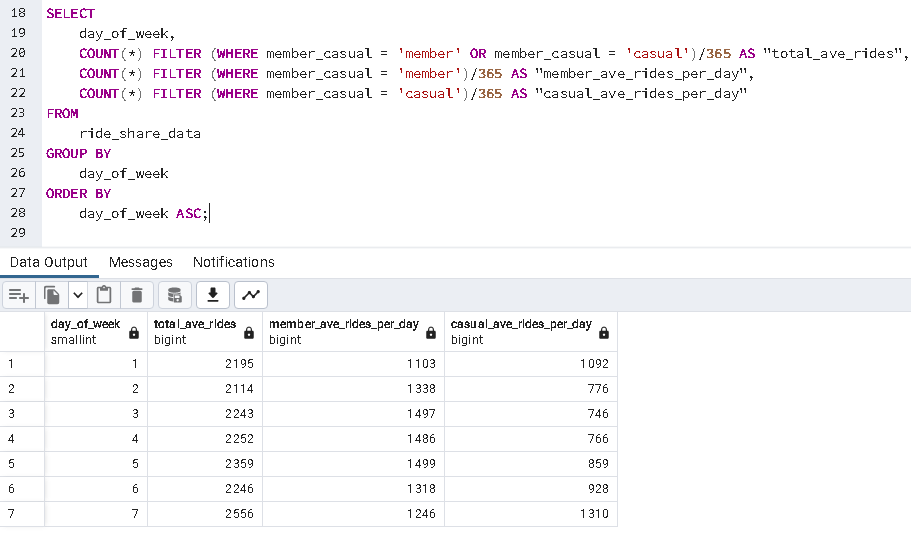
SQL
After transferring the data to SQL, I conducted a thorough analysis and extracted valuable insights on emerging trends. This included cleaning the data, comparing average ride time by rider type, comparing total rides by rider type, and finding which day of the week has the most rides by rider type. To see a detailed walkthrough for SQL along with the scripts, follow this link.
Tableau
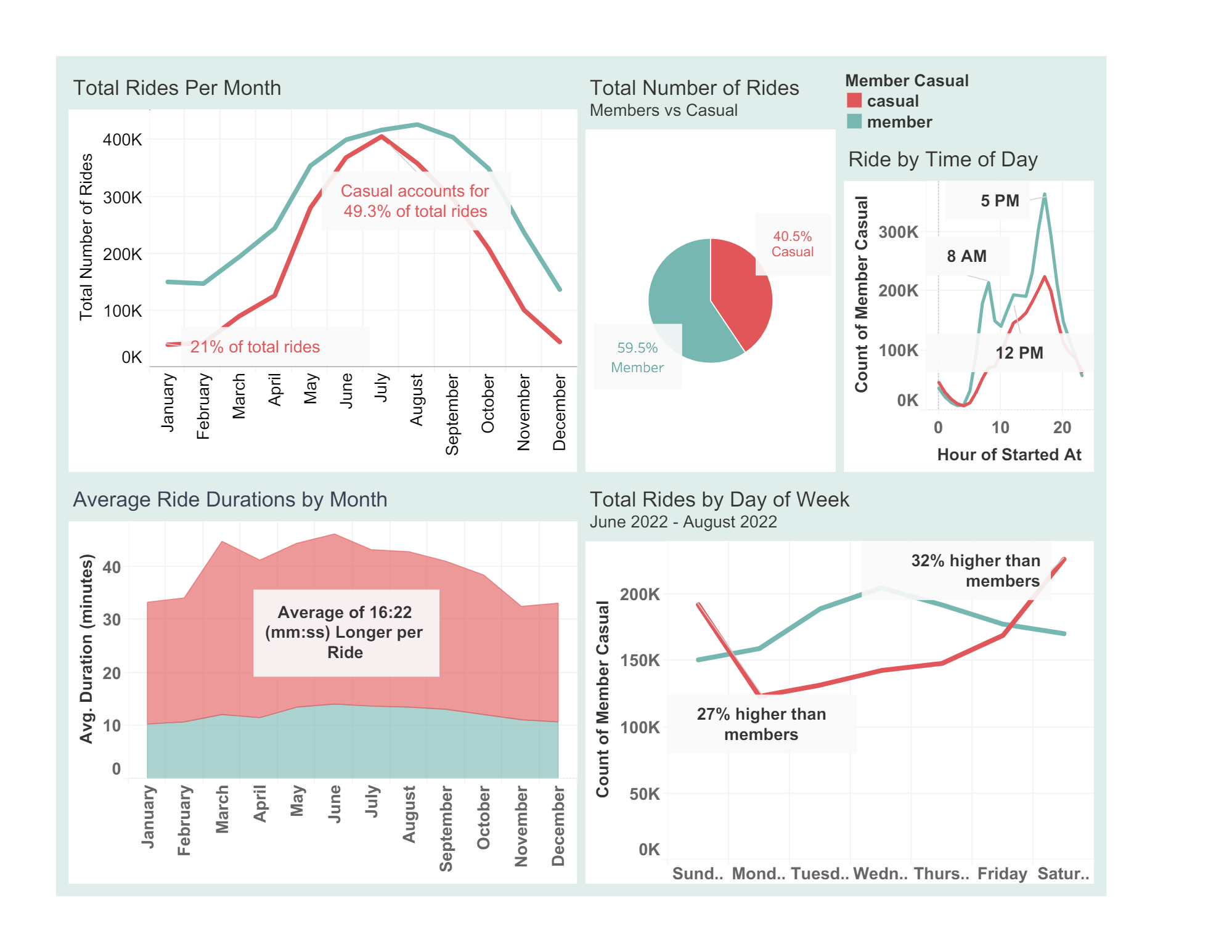
Following data cleaning and analysis using SQL, I leveraged Tableau to create several tables and visualize the data in various ways. While designing the tables and adjusting the filters, I uncovered additional insights that I had not previously noticed. This link to my Public Tableau dashbord shows some of my observations.
Presentation
Drawing on the insights obtained from Excel, SQL, and Tableau, I synthesized the data into a clear and compelling narrative using a Google Slide presentation. The presentation highlights the key trends and patterns in the data, and includes detailed visualizations and analyses to support the conclusions drawn from the data. Additionally, I provided actionable recommendations for stakeholders based on the insights gained through the analysis, in order to inform data-driven decision-making. Follow this link to see the full presentation.
Summary and Recommendations
- Offer discounted rates for longer-term memberships: Since casual riders tend to take longer rides, the company can offer discounted rates for monthly or yearly memberships to encourage them to become members. This will incentivize them to ride more frequently, and the lower cost may help them justify the upfront expense.
- Increase marketing during peak casual rider months: Since casual ridership is highest during the summer months, the company can increase its marketing efforts during this time. This can include targeted social media ads, promotional offers, or partnerships with local tourism organizations to attract more casual riders.
- Develop a loyalty program: Members already receive perks such as lower rates and priority bike access, but the company can develop a loyalty program that rewards frequent riders with additional benefits. This can include things like free ride credits, exclusive access to events, referral incentives, or even partnerships with local businesses for discounts. By offering additional incentives to ride, casual riders may be more likely to become members.
***To gain a better understanding of rider habits, it is necessary to conduct further research, including the analysis of rider IDs linked to each ride. Our current assumption is that the high number of casual and member rides is attributable to a large number of riders. By gathering data on the frequency of rides per rider, we can gain additional insights into how often each casual and member uses our service.***