TSLA-Analysis
TSLA Analysis
Benjamin Ramirez updated 3/22/2023
Introduction:
Welcome to the Stonebridge Investments Stock Regression Analysis case study! In this case study, you will be playing the role of a financial analyst working for Stonebridge Investments, a leading investment firm. Your manager has asked you to analyze the performance of Tesla (TSLA) and compare it to the broader market represented by the S&P 500 ETF (SPY) from January 2020 to present. You will need to conduct a regression analysis to understand the relationship between TSLA and SPY and to evaluate TSLA’s performance relative to the market.
About the Company
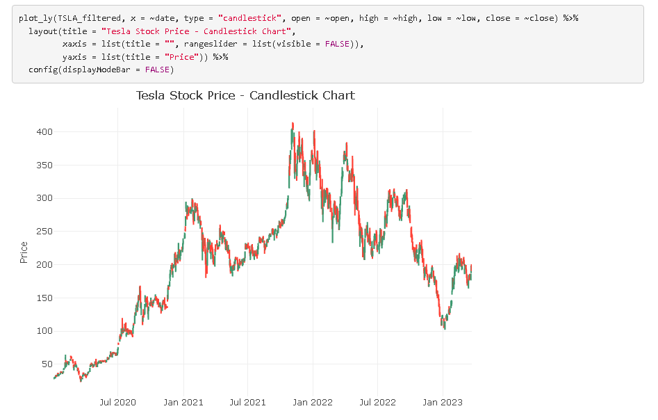
As part of your role at Stonebridge Investments, you are tasked with conducting a stock regression analysis of TSLA and comparing it to SPY from January 2020 to present. Your analysis should include daily closing prices for TSLA and SPY and you should consider factors that could impact TSLA’s performance such as news events, earnings releases, and broader market trends. Your goal is to understand the relationship between TSLA and SPY and to evaluate whether TSLA outperformed or underperformed the market over the time period analyzed. You will present your findings and recommendations to your manager and the investment team.
Disclaimer: Please note that Stonebridge Investments is a fictitious company and has no affiliation or relationship with any existing investment firm. Although based on actual stock prices, this case study is intended for educational purposes only and should not be construed as financial advice or a recommendation to invest in any particular stock or security.
Programs and Languages Utilized
- R Programming Click here to view the detailed walkthrough
- Google Slides link to presentation
Walk-through Summary:
R Programming
R programming is a robust software tool for data analysis and visualization. In my project, I started by importing data into R from https://posit.cloud/ and performing data cleaning tasks. Leveraging the capabilities of R, I extracted various statistics and generated visualizations to gain insights from the data. I have included screenshots of my code and visualizations to showcase the analysis and visualization process. To see the entire markdown report, click this link to view the detailed walkthrough
Presentation
I used Google Slides to create a presentation for showcasing the data. I have attached a couple of images for a quick review. While other visualization software may offer more visually appealing charts, I chose to include the R programming charts to demonstrate my proficiency in R programming. To see the presentation itself, follow this link.
Summary and Recommendations
After thorough analysis, my conclusions are as follows:
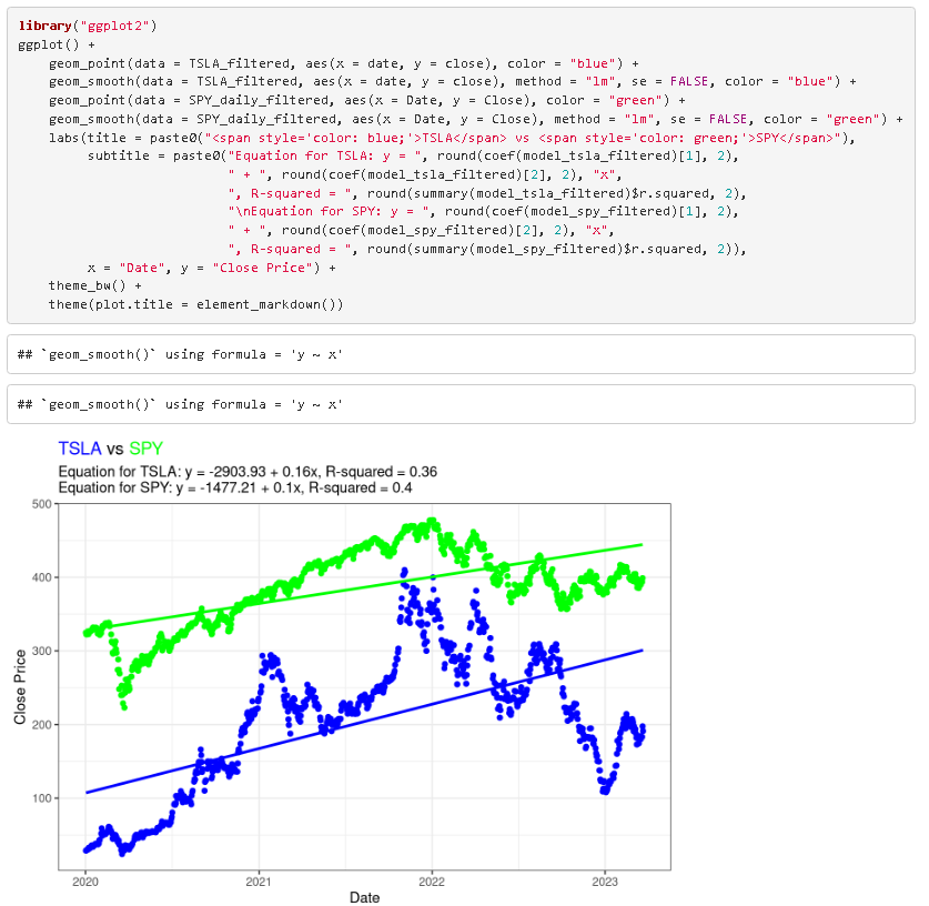
- Both TSLA and SPY have positive slopes, indicating a generally increasing trend in their stock prices over time.
- The slope of TSLA is higher than that of SPY, suggesting that TSLA has been increasing at a faster rate than SPY.
- The R-squared value for TSLA and SPY is 0.36 and 0.4 respectively, indicating that the regression line explains less than half of the variability in TSLA and SPY stock prices. This suggests that there may be other factors affecting the stock prices beyond the ones included in the regression analysis.
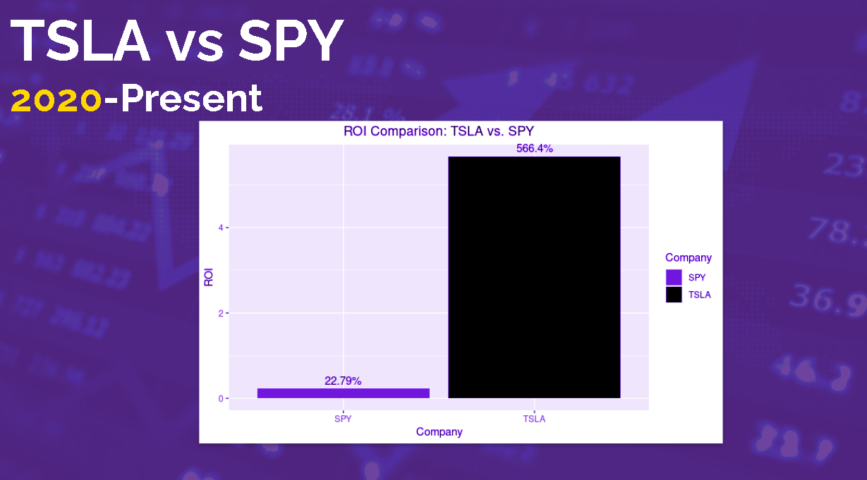
- This analysis suggests that Tesla's stock price had strong growth during analyzed time period, outpacing the broader market represented by SPY.
- Overall, the results suggest that TSLA may be a more volatile and unpredictable stock than SPY, but TSLA may offer more returns given its lower R-squared value and higher slope. However, further analysis would be needed to confirm this.